NOTICE: This post references card features that have changed, expired, or are not currently available
Last weekend, I published a Club Carlson contest where I asked people “If you had the new Premier Rewards Visa Signature Card, how would you use the bonus points and bonus award nights?” (Note: The Bonus Award Night feature was discontinued as of 6/1/2015.) See “Club Carlson Prizes!”
I’ve found it interesting when reading the entries to see how many people have similar goals or aspirations as each other. Specifically, Paris and Chicago stood out to me as being extremely popular choices. If I had to guess, I would have said that 60 or 70 percent of the responses were for Paris or Chicago. I would have been wrong.
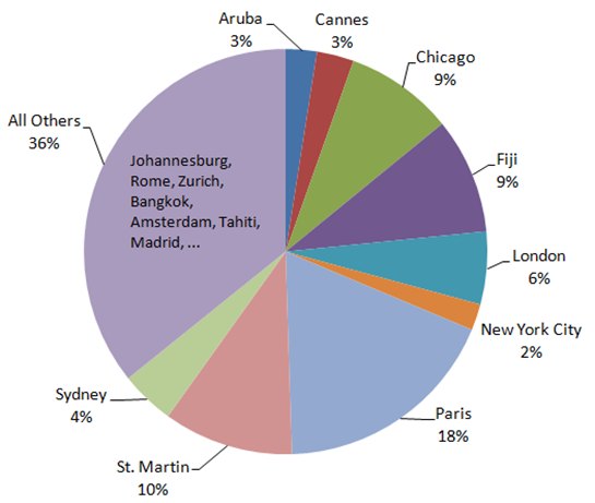
I took the data from about noon yesterday and charted it. As you can see below, Paris and Chicago were both very popular but with only 18% and 9% of the vote, respectively. In other words, my estimate was way off. Other very popular destinations include St. Martin (10%), Fiji (9%), and London (6%).
With this contest, I’ll pick two winners who will each get:
- A full year of Club Carlson Gold Status, and
- A $500 Visa gift card
To read full details about the contest and to enter, please go to the original post here: Club Carlson Prizes! No entries will be accepted after 11:59 PM EDT today (Friday April 5th).
Note: I’m on vacation this week, so please forgive me in advance for not answering comments.


Maui, it is, for a return visit for the family! Hawaii is such a beautiful place, we just cannot get enough of it.
Next trips are Orlando (family trip) and Montreal (just the two of us). Still contemplating next year’s trips.
I only got a BS…no idea what the phd or mba are talking about, but pie works just fine with my simple mind… : )
@Morgan Freedman: I agree, it’s tough to visually distinguish pie chart values when they contain essentially identical percentages like 3%, 18%, and 36%. I wish the graph were color-coded or expressly noted the percentages.
also, I only have a PhD in Computational Mathematics and went to an 11th ranked MBA program, so I have no idea what you’re talking about.
And if anything, at least sort it by size, not in alphabetical order, which is meaningless.
Pie charts illustrates little because of the impossibility to distingushes relative sizes unless it’s very obvious. Clearly you geniuses never worked in management consulting or attended the top 10 MBA programs.
Bill/JB: Chicago is a great city to visit and it has a really nice Radisson Blue property (one of the few in the US).
Our next trip to Rome, Paris, London plus Poland….
@Morgan Freedmen Go do something constructive.
@Morgan Freedman What!!?? Corporate America is full of pie charts. Simple frequencies seems to be the most business people can comprehend. On the positive side, they covey information easily and FM was successful at showing that.
Paris, just to begin with:)
Pie charts… Another reason why you’ve been fired from corporate America. No offense.
Chicago? WTF
Why Chicago?
St Martin for sure !!
Paris and St. Martin are top of my list …..