NOTICE: This post references card features that have changed, expired, or are not currently available
Yesterday we unveiled our new homepage and the response was… not great. Let me rephrase that. We received lots of great responses, but most were negative. The homepage was too confusing. The mobile ads were too big. Most of all, people simply wanted an easy way to see all of the latest blog posts in one place.
So the team got together, brainstormed solutions, and updated the site. I was happy with the site before and now I’m even more excited about it with the latest changes in place.
Here’s where we stand on each of the major pain points:
Homepage too confusing
We’ve dramatically simplified the page. There are now just four elements to the page: the article spotlight (selected articles that we think are worth keeping front and center for anyone who missed them when first published), latest blog posts (all of our posts sorted with the most recent on top), multimedia (links to podcasts and YouTube videos), and the sidebar. That’s it.
Mobile ads too big
The funny thing about this issue is that it is a coincidence. The big ads you are seeing on mobile would have been on the old site too. The majority of Boarding Area’s direct ad deals have paused as a result of the current pandemic. Now ads are being backfilled by Google’s ad exchanges. And most of these ads are using up all of the available space instead of being the normal old ad size. Bummer. We couldn’t fix this one.
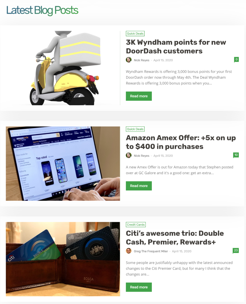
All of the latest blog posts in one place
Done. Simply scroll past the article spotlight and you’ll see the “Latest Blog Posts” section.
Page Elements
Article spotlight:
Latest blog posts:
Multimedia:
Original (now out of date) post follows:
Carrie and the Boarding Area Team got it done! The Frequent Miler blog has been running on a rickety old WordPress Theme since the beginning (Fall 2011). Carrie’s first assignment as our Creative Director was to select an up-to-date theme and redesign our homepage. Today she worked with Boarding Area to launch the new design. Done!
Here’s a quick tour…
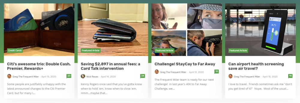
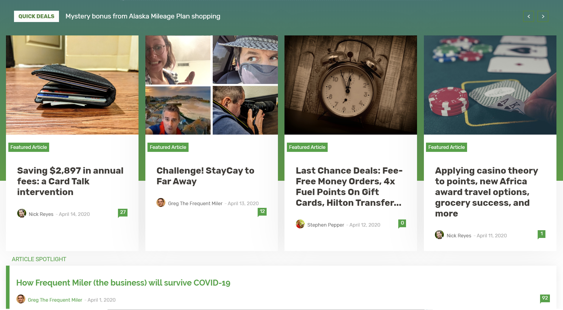
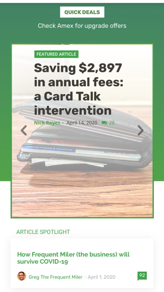
Featured Articles (and Quick Deal carousel)
The top of our home page first shows Quick Deals in small text. Quick Deals are shown much bigger further down the page, but we wanted something at the top to grab your attention in case there’s a juicy deal going on.
Next, we show several “featured articles”. Regular readers may or may not be aware that we differentiate between our “big” featured articles and the other stuff (Quick Deals, Quick Tips, and more). At the top, you’ll find the “big” articles. These are the articles that we publish each morning around 6:30 or 7:00 am ET as well as some others that we post during the week depending upon circumstance. You can think of these articles as being the “meat” of the blog.
below the latest featured articles you’ll find one “article spotlight”. This is an article that has rolled off the top of the homepage because newer posts have pushed it away, but we think it’s still relevant and worth keeping front and center. Carrie is working on making this section more graphically appealing in a future update.
On mobile, this top section is a little different in that it only shows one featured article at the top, but you can swipe to see more:
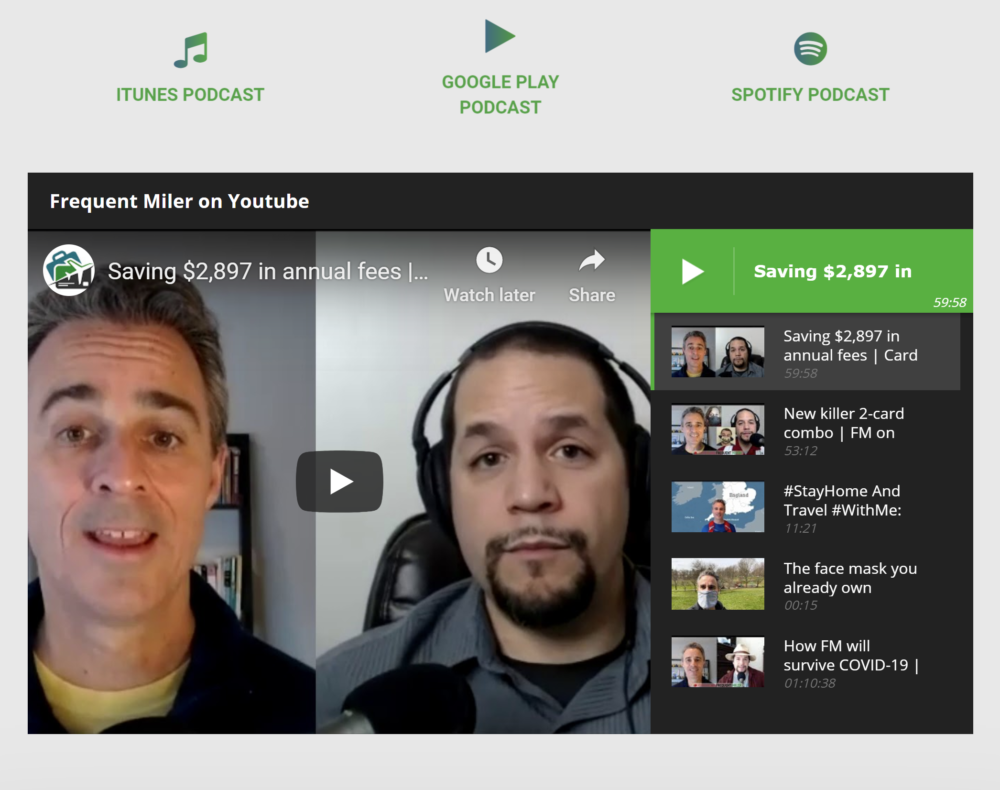
Multimedia (podcasts & video)
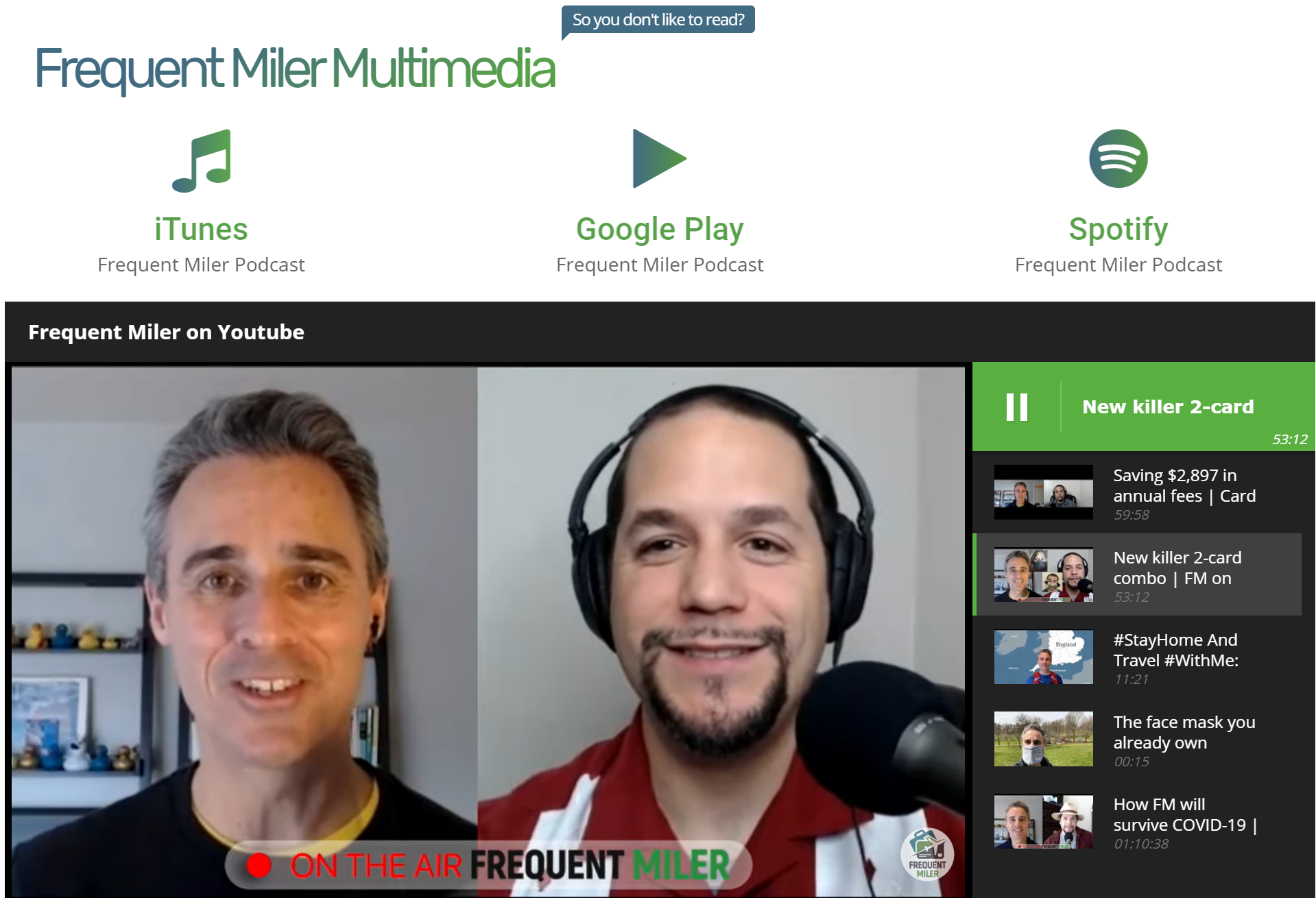
Recently Frequent Miler has become more than just a blog. We have our podcast + video series (Frequent Miler on the Air) plus a few more video series. And, of course, if you’ve been following our StayCay to Far Away plans, you know that we’ll be posting many more videos soon. Now, all of that is easily discoverable on our homepage.
If you think of featured articles as the meat, then maybe the multimedia section is the sauce.
Quick Deals, Tips, and More
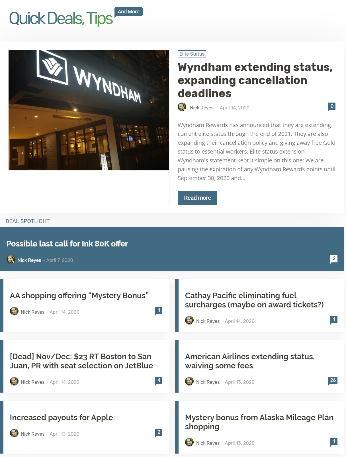
The Quick Deals, Tips, and More section is designed to show all the other stuff. This is where you’ll find all articles which are not “Featured Articles”. We categorize each of these articles as Quick Deals, Quick Tips, or Quick Reads.
At the top of this section is the most recent of these non-featured-articles. Next you’ll find a “deal spotlight”. This is a deal (or other type of post) that we felt was worth highlighting. Maybe its an extra special deal or one that we think is important for people to know about for other reasons.
If we stretch out the already tortured analogy, this Quick Deals, Tips, and More section is the dessert.
Sidebar
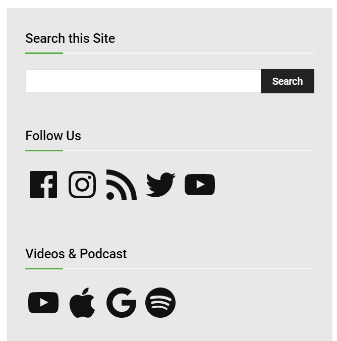
On the sidebar you’ll find a new and much improved search box. Start typing and it will automatically suggest articles to you before even pressing the Search button.
We’ve also added additional ways to follow us. For example, please follow us on Instagram and Youtube. On both platforms we’ll apparently unlock additional features if we get more followers so we appreciate your help with this!
The Frequent Miler team is excited to get this new look and new functionality. I hope you like it too!
[…] worth our while. We focused on SEO (search engine optimization), did a site redesign…then redesigned that redesign, and created more useful resources like the COVID credit card enhancements […]
[…] Updated! Check out Frequent Miler’s New Homepage […]
I noticed if I clicked on the comment with the number of replies on the front page for a post, it will lead me to the top of the comments, which is great. But it does not jump to the top, instead it will start from the top of the post and scroll down. It is inconvenient especially for a long post like Greg’s summer vacation Marriott edition. Is it possible to remedy that?
I hate this new format.
It looks like the points guy knock-off website.
To be honest, I’m not a fan. The boxes/article features are far too big. The tiles should be smaller in my opinion in order to be readable and easily digestable. I understand the impetus but this feels like a confusing downgrade.
Wow, now I really like the new / improved format. Very simple, very easy to navigate. Only 4 sections. Thanks for fixing so fast!
Digging the enhancements and love the increased focus on the multimedia. Few quick recommendations:
1)Overall I think the boxes/tiles could be a bit smaller (especially within the Latest Blog Posts Section) it takes quite a lot of scrolling to get down the page.
2)The media section(podcast/youtube) placement feels a bit random. Wonder if it could instead permanently placed in the 4th tile (header section of articles on the far right), or built into the side bar (Search this site). May even warrant being added to the top menu bar as Podcasts
3) Inconsistent grey space in between sections on the right search bar area. I think removing a bit of the gray space will be helpful. The area feels like it may be taking up too much real estate in terms of width.
1) I agree 12 small boxes 2 rows.
#stayincave LOL
I’ve been reading FM’s older articles and I just lost all my progress now. It’s impossible to find articles beyond a few weeks unless you keep pressing “Load More”. Could you at least bring the “pages” function back?
Hey, I just wanted to thank y’all for your humility and willingness to take feedback from those who frequent your site to make this update to your update.
I’m sure it didn’t feel great that months (or years..?) of work and effort wasn’t well received by your audience, yet you put your egos aside and responded to the criticism by incorporating people’s feedback into the new, new design.
Overall I like the revisions to the update. I think it accomplishes what you were trying to do (fresh update, clearly delineated content, more multimedia), while keeping it relatively simple and content focused. One small thing that I would like to point out is that on the desktop version, the white spacing on the left and right edges is uneven (there is more white space on the right side of the screen).
Again, thank you for being willing to listen, adjust, and work for the win-win!
I’m not a fan of the new design. It’s just too confusing. It does look a little better today, though, than yesterday.
What do you find confusing?
Yesterday it looked like the posts were listed out of order, and so it was hard to figure out what was new. Thankfully that’s not the case now. I think what’s confusing for me now is the change in font/colors and layout, which takes a little getting used to. On the other hand, I love the additional video content you folks are posting, thank you!
Yes, I understand the issue yesterday. But since you commented after the update tonight, I was wondering if something else was confusing. I assume you’ll get used to new colors soon enough.
We made the change to make it more chronological today than we had it yesterday. The idea behind the new layout as it looked yesterday was actually in part to make the content you want easier to find, but we made changes to it today because it obviously didn’t work out that way for everyone.
Interestingly, the posts have never been listed a strict chronological order. The full morning article we write each day was always sort of stuck to the top of the page with quick deal posts (and something we call quick tips) always appearing below that even though they were newer. The next day’s morning post would push the previous day’s morning post down into chronological order among the quick deal posts (or sometimes we’d have a second “article” type post — longer format — come out during the day that would push the morning post down below the quick deals again).
Part of the impetus behind the new theme was to make that daily morning meat-and-potatoes content we write (that quite often takes hours to do) stand out rather than being continually pushed down the page by something like a very short post about how hotel chain X is offering 200 bonus points for filling up your gas tank at gas station Y. We definitely want to cover those types of opportunities, but wanted to have a way to make the more in-depth content stand out rather than let it get buried by quick deal posts. So that’s the motivation behind having some featured articles at the top — to make that type of content more prominent. So we still have that featured articles section at the top where you’ll find the latest of those bigger articles. But among the changes today, we now have all of the posts sorted chronologically right below that.
Glad you like the videos. We obviously also wanted a way to make our video and podcast content accessible as we’re spending a growing amount of time working on those things as we expand content and want an easy way to find them from the home page.
Thanks Nick for your thoughtful reply. To be honest, I actually have dyslexia, so it’s harder for me to get used to new scripts and written layouts than other folks. And that’s actually another reason i love the new video content, because my dyslexia isn’t really a factor there.
First, I’d like to thank you for responding quickly to reader concerns. The revised designs is a great improvement!
What I still find confusing is the multimedia section. When I scroll the “latest articles” section, there are only three cards and then the multimedia section. What is below that section? Is that the continuation of the “latest”? Why is the multimedia section in the middle of the feed? I’d expect it to be on the side or maybe before/after. As is, it makes it feel like the “latest” has ended (I kept looking for an “older” or “more” button until I noticed there are more articles after the “multimedia”). I’d prefer a way to see just the clean feed of articles (maybe make it possible to click the header for that? That was my intuitive move). On the bright side, the multimedia section is looking much better in mobile now.
Second, and far less important, is the carousel feature on mobile. I think moving elements are distracting, and a bit of an eye sore. I’d much prefer a simple list, where I can see all of the featured articles in one go and decide which to click. Or, perhaps, simply a pinned article or two at the top of new content. I guess the bottom line for me is simplicity and seeing the content immediately and plainly.
Either way, these are just my opinions, and while I think that the design is still less than ideal, you obviously can’t cater to everyone individually. Altogether, it’s altered enough to allow me to find the content I want, and that’s what’s important to me as a reader. The new design for the articles themselves is very pleasant, btw.
Thanks for your hard work and responsive communication with readers!
Thanks for the detailed feedback Tami!
Latest articles: Yes, the media section is simple in the middle of the list of latest articles. We hoped that by indenting the media section it would make that clear (just like people are used to ads being in the middle of content these days). We also debated adding a hyperlink above the media section that says something like “More Articles ->” and clicking it would simply scroll you down to the next article under multimedia. We’ll explore options like that if it proves to be a problem without it. We don’t want the media section to be too far down the page that people won’t find it.
Mobile carousel: Unlike many other web sites, the carousel doesn’t automatically move to the next article after a few seconds. It just sits there motionless until/unless you swipe. So, I’m not sure why this would be distracting? Can you elaborate? To me it just looks like a still image that I can either scroll past, or swipe to the side if I’m interested in seeing more.
Thanks again for your feedback and engagement in this.
Echoing Greg, thanks for the feedback. He explained why the multimedia is where it is. If you keep scrolling, you’ll see that the article flow continues after the multimedia section. The articles are all dated and the date appears directly under the headline, so hopefully it’s fairly intuitive to see that it’s chronological or at least will be as you get used to seeing things like the date in a slightly different place / font.
It’s a better site today then before .I have a new W10 LT it’s clearer and u have ur newer podcast (clearer too) area out there which is the future . It’s not that big of a deal to use now or for u to change later .
#stayincave LOL
The revisions look great! Thanks for being responsive. My only suggestion at this point is that the sidebar looks like one block of text rather than individual titles. Single spacing within each title would go a long way toward making that read better.
Much better than yesterday, you guys. Thanks for the quick fixes!
We heard you! We updated the homepage earlier today in response to reader feedback. Please see the updates described at the top of this page!
Good changes. Thank you! Very impressed that you all reacted so quickly to your reader feedback. Thank you for the site and content and all that you do!
Boarding area has been a ad laden, snail fast site with way too many pop ups….so where did this lady work?, Bonvoy?….you will have your new site in 2-3 years, but it won’t work 1/2 as good as the old one….chuckle….sorry to be a troll, but right now she deserves it.
How do u think he makes his money a Government Grant ?
#stayincave LOL
UPDATE 4/15/20 3:25PM: Thanks to reader feedback we are in the process of making several immediate enhancements to the new homepage. Please check back later for a new update saying that the changes are in place!
I’m very Sorry that’s not fast enough and u have to many negative posters here . I wonder will the hotels have less bed bugs now since no one is there ?
#stayincave
LOL