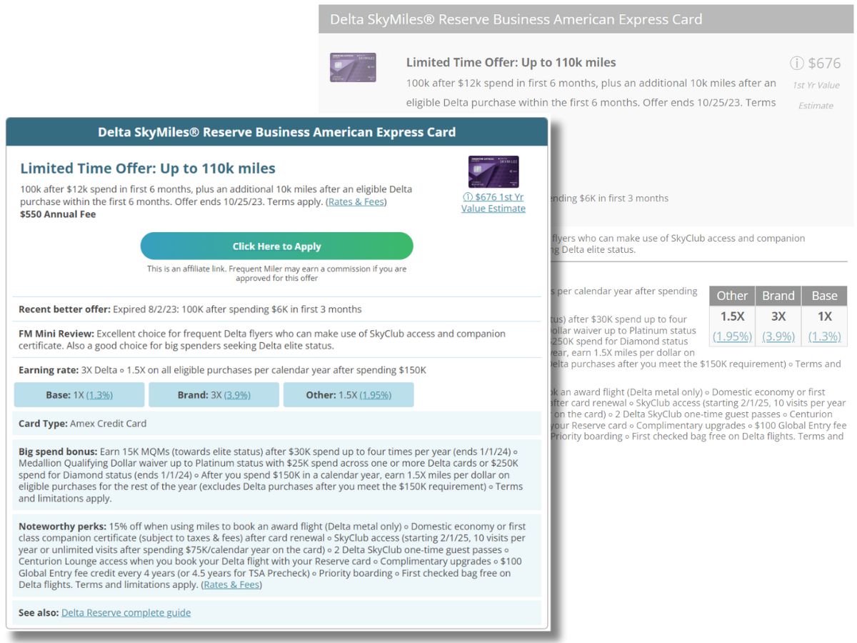
For the past several weeks, Carrie and I have been working behind the scenes to refresh our credit card displays and, as of yesterday evening, the new formatting is live!

The card-display refresh had a couple of goals. One was to simply make our credit card displays look nicer. I believe that was achieved (credit: Carrie)! Another goal was to simplify how we store and render credit card information. The data is now less than half the size it was before and, more importantly, it will be much easier to make changes to these displays going forward.
Right now, the information shown in the credit card displays is the same as before. It just looks different. Going forward, we’re going to be able to make changes more easily so that we can continue to improve our card displays. Some long term goals include updating and expanding the category bonus boxes (which will make our Best Category Bonuses page even more useful), link to related Card Talk segments from our podcasts, provide more information about the rewards that are earned with each card, and change the wordier parts of the displays (such as “noteworthy perks”) to show fewer words but more key high level information with a way to click for more details.
While we think that the roll-out of the new display has gone smoothly, we can’t be 100% sure that we caught all of the issues. If you find any problems, please comment below. In the meantime, you can check out variations of the new displays in many places across the blog, including:
- Best credit card offers
- Best rewards for everyday spend
- Best category bonuses
- Best big spend bonuses
- Greg’s top picks


It does look nicer, crisper. But on the Best Card list at the top the 1st year value is missing now.
Oops, suddenly it’s there, sorry. Very nice.
Absolutely my #1 resource for CC hunting, so thanks for making it better.
One thing I’ve been dreaming you’d add is a checkbox to toggle which issuers are shown. For example…I know I’m over 5/24, so if I could uncheck Chase that would clean up the list significantly. I also know Cap One hates me nearly as much as they hate Greg, so I could uncheck that as well and just see the relevant offers.
People in Amex pop-up prison could uncheck Amex as well.
Thanks for always being awesome!
Did you take away the recent best offer?
Looks like it’s listed above the mini review but isn’t present on all cards
Tonei is correct. We haven’t always checked that on cards that don’t change offers often and or when the recent best offer information has gotten kind of outdated, we have sometimes eliminated it. That was all true before. We didn’t take anything out in that regard.